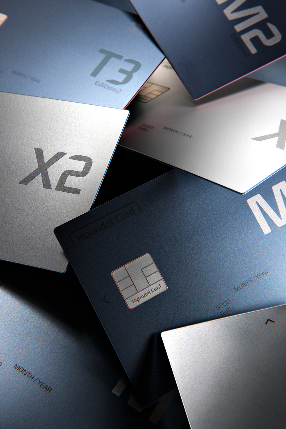
Hyundai Card Chapter 2
2014
Hyundai Card Rebranding
Concept development
Graphic design
Package design
Product design
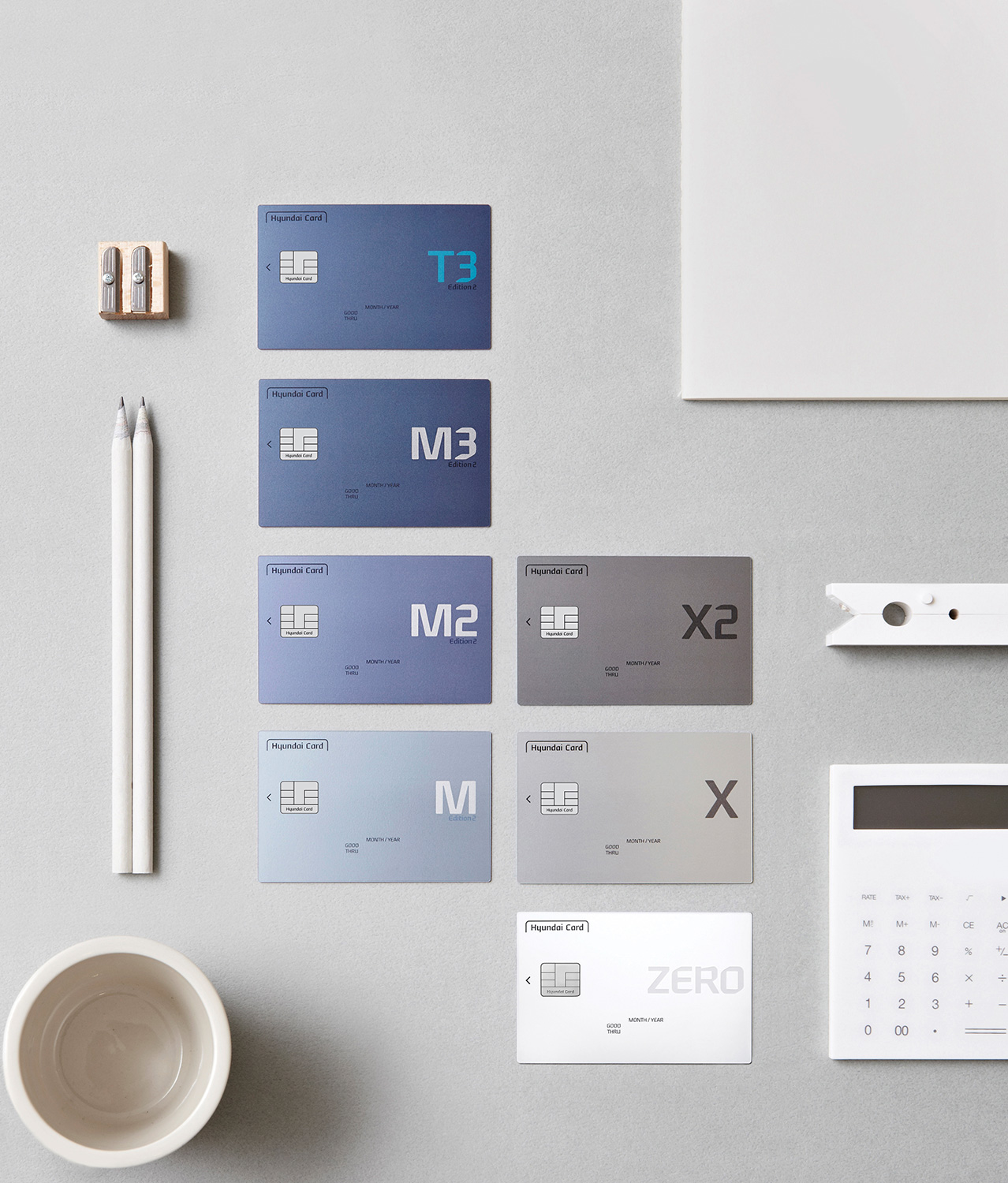
The small plane, 85.5 X 54 mm in size, displays the information that
identifies the card. All of the information is critical, but there
clearly is a priority. The layout should be visually beautiful. Hyundai
Card Design Lab has set three standards—Extract, Balance, and Align—for
the latest card plate design to make the layout more refined and
balanced. We boldly removed what could be removed from the previous
layout and re-arranged each element on the card plate based on a precise
grid system for overall balance.
![]() Obsession with detail is one of the major directions of Hyundai
Card’s designs. The latest design renewal project also considered the IC
chip, which has been left out from the design process when it is an
important element of function. First, we matched the outer round of IC
chip with IR so it goes better with the 1R card plate (the outer round
of the card plate is 1mm) which was presented right before chapter 2.
The product name which used to be on the center using a larger font size
was re-arranged for balance with the IC chip. Also, we placed Hyundai
Card logo inside the IC chip, and this is the world’s first example of
brand identity inside the IC chip.
Obsession with detail is one of the major directions of Hyundai
Card’s designs. The latest design renewal project also considered the IC
chip, which has been left out from the design process when it is an
important element of function. First, we matched the outer round of IC
chip with IR so it goes better with the 1R card plate (the outer round
of the card plate is 1mm) which was presented right before chapter 2.
The product name which used to be on the center using a larger font size
was re-arranged for balance with the IC chip. Also, we placed Hyundai
Card logo inside the IC chip, and this is the world’s first example of
brand identity inside the IC chip.
 Obsession with detail is one of the major directions of Hyundai
Card’s designs. The latest design renewal project also considered the IC
chip, which has been left out from the design process when it is an
important element of function. First, we matched the outer round of IC
chip with IR so it goes better with the 1R card plate (the outer round
of the card plate is 1mm) which was presented right before chapter 2.
The product name which used to be on the center using a larger font size
was re-arranged for balance with the IC chip. Also, we placed Hyundai
Card logo inside the IC chip, and this is the world’s first example of
brand identity inside the IC chip.
 Color
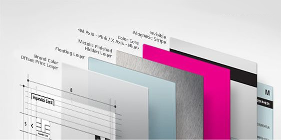
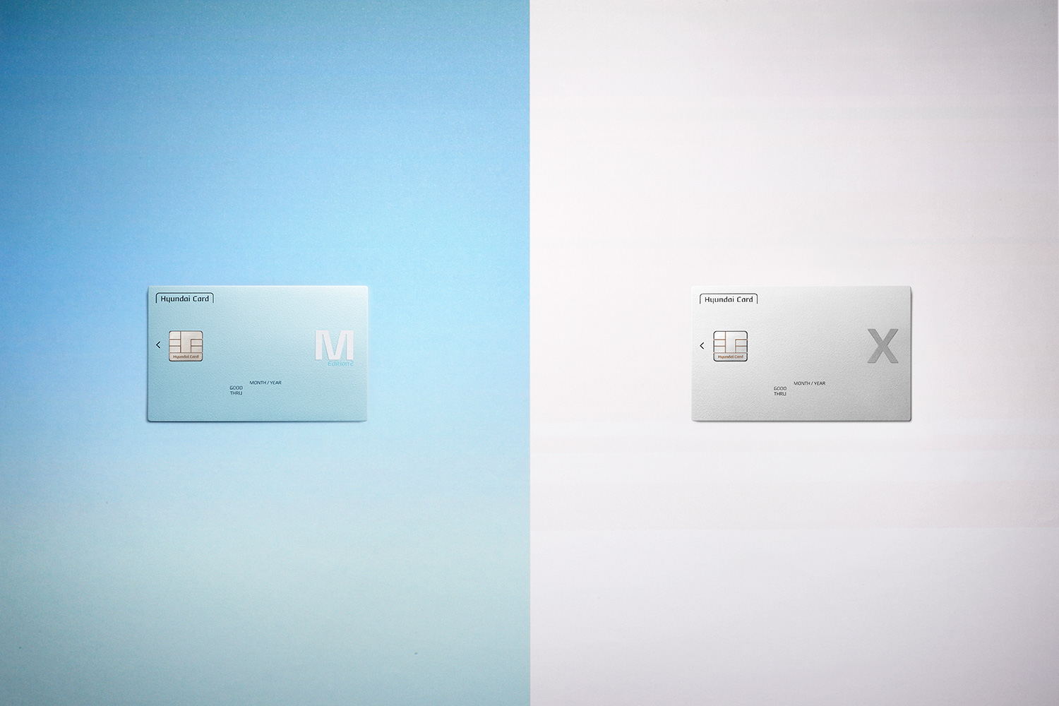
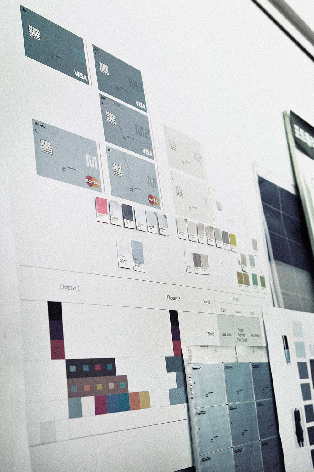
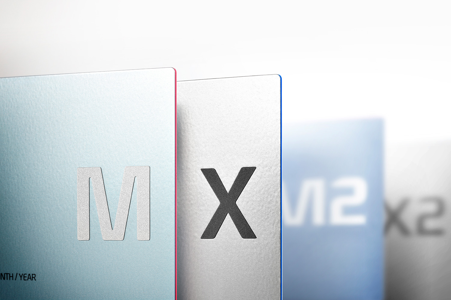
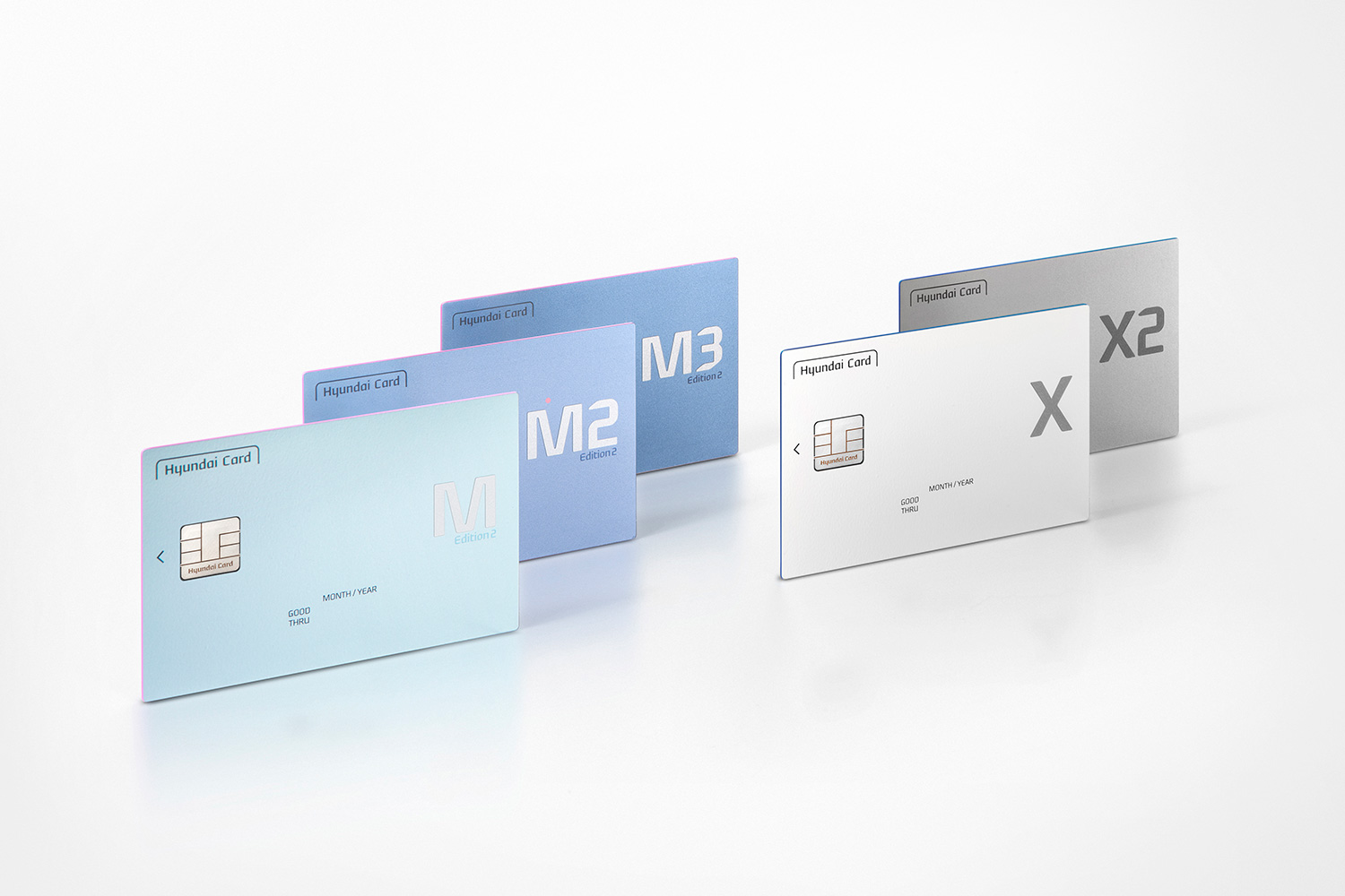
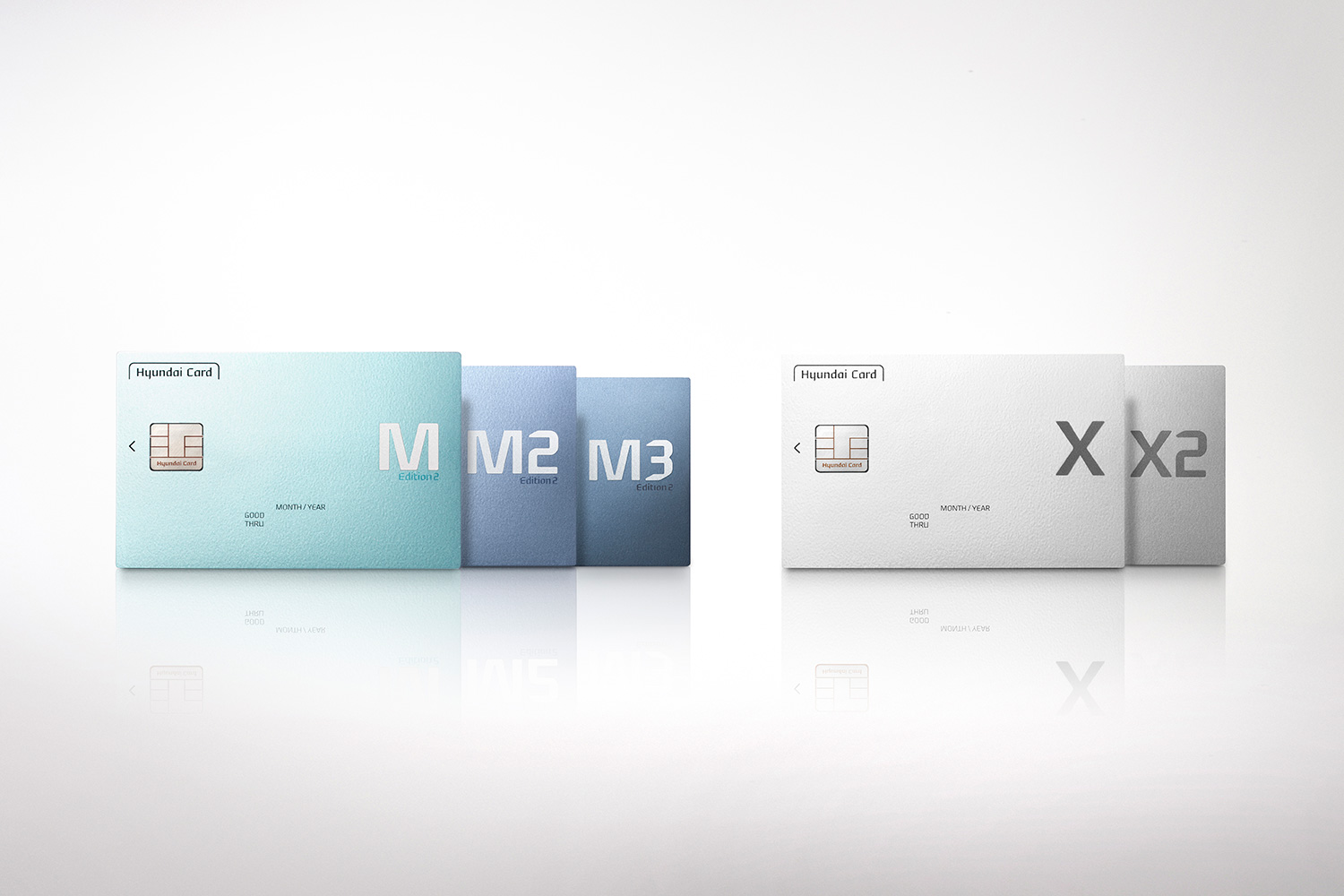
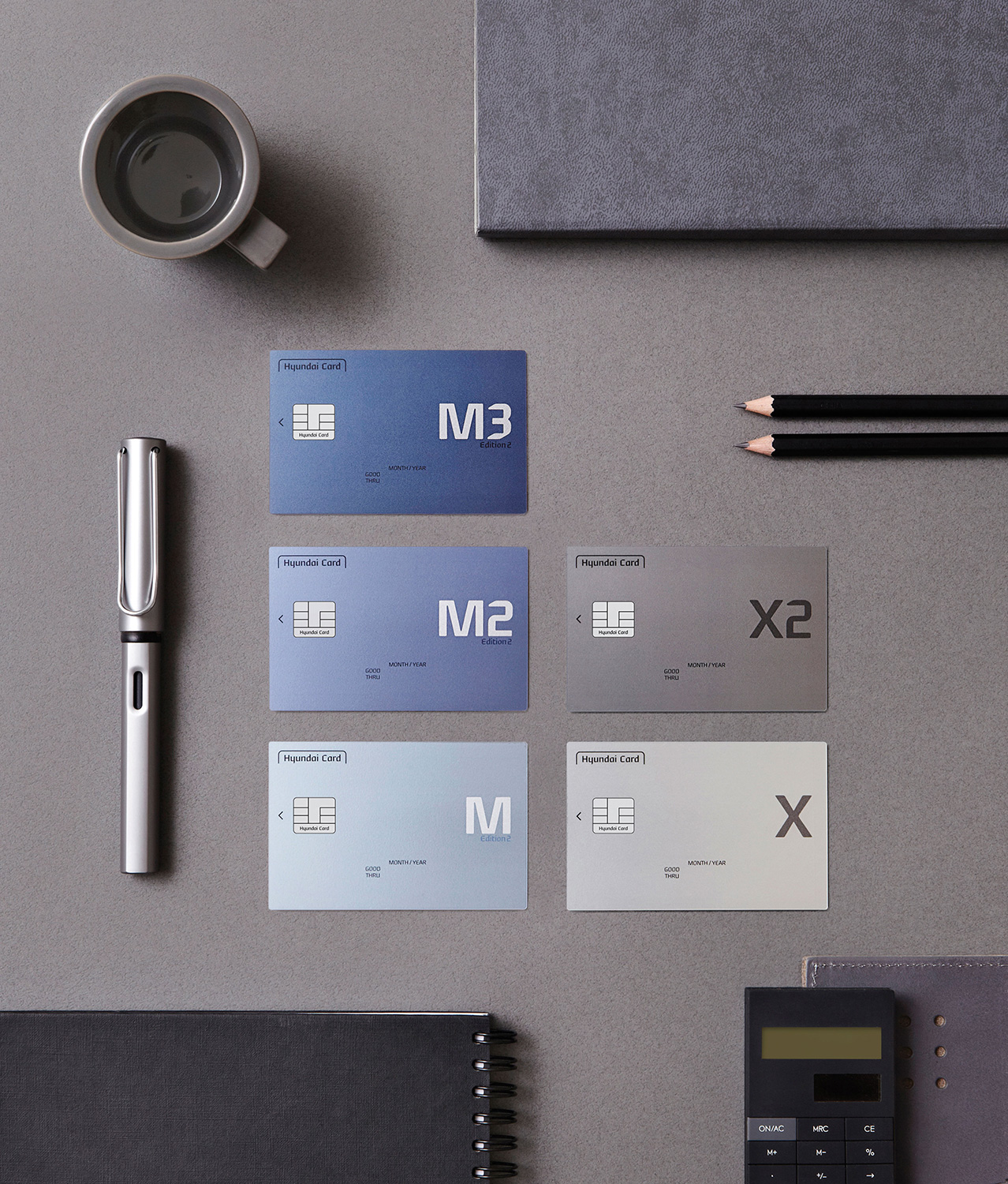
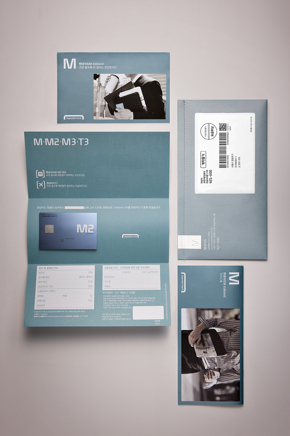
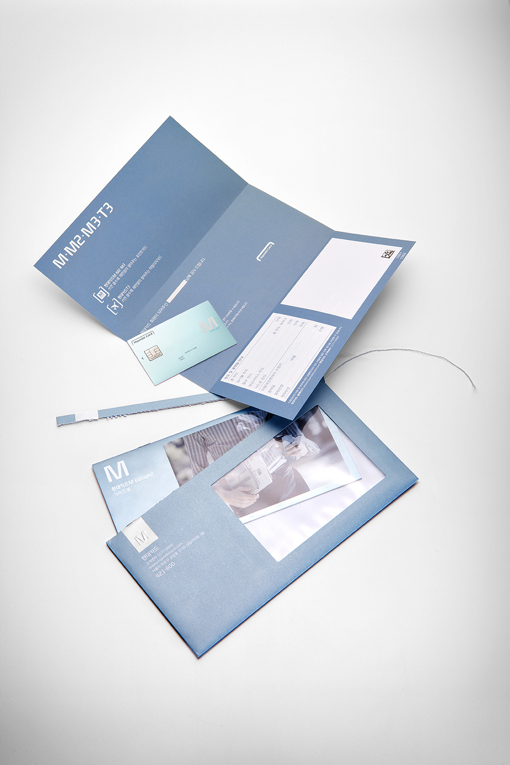
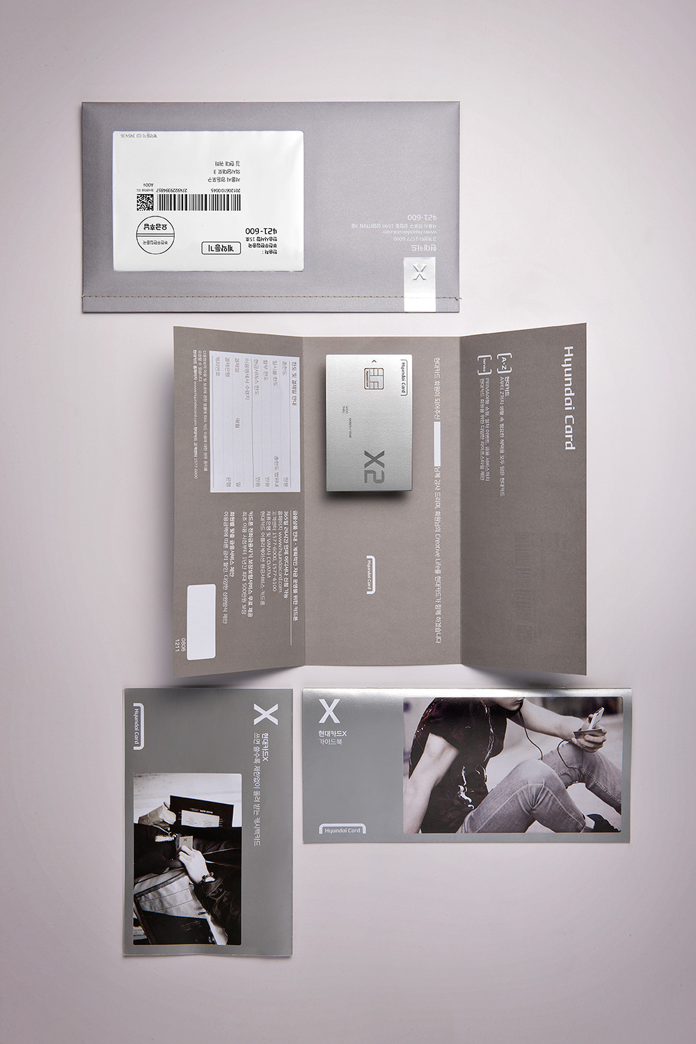
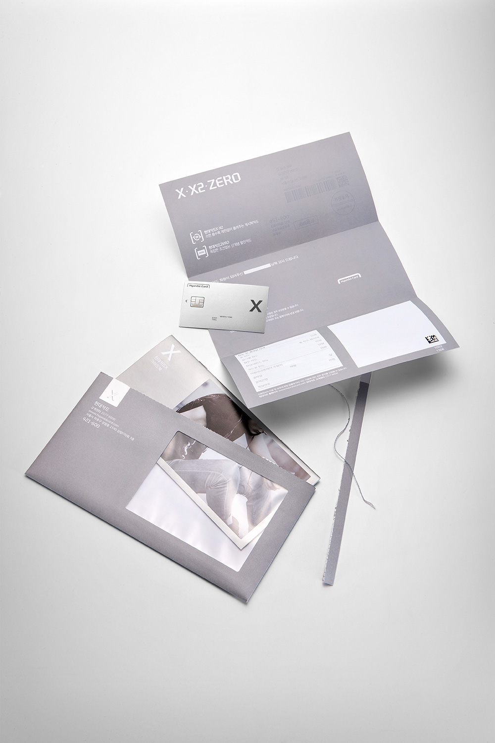
ColorWe chose two main color schemes symbolizing the two clear systems of points and cash back for chapter 2’s Two Track. The M group for the points applied the M Blue color to carry the basic heritage of the M series, while the X group created a new color called X Silver, which is metallic silver that adds sparkle to an ordinary white for the everyday life and the basics. Also, we modified the brightness and saturation of M Blue and X Silver to intuitively express the level of benefits available for each card.

Material Study
